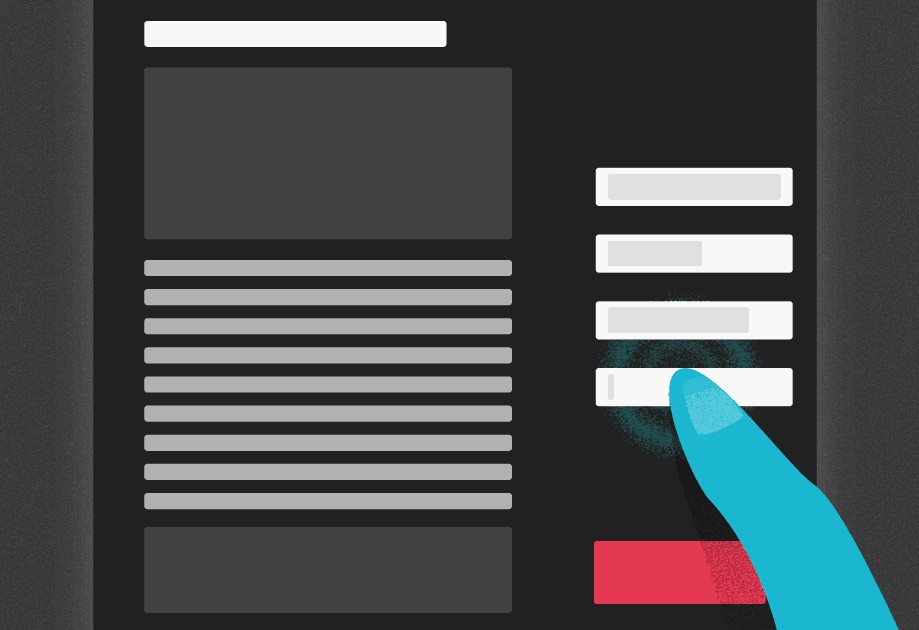
A person browsing online sees your ad and clicks on it. The page he arrives on, on your website is called a Landing Page. What’s the big deal; isn’t it just a link to the homepage? Absolutely not! The landing page should be custom-made to the offer that your visitor has shown interest in. That is the first lesson, #1, in creating a result-driven landing page. Clicking on your ad should be a high-quality event for your visitors, and the message they see on the landing page should be a solution to their needs.
If you found that interesting, well, then read on! There are other lessons to learn on creating an awesome landing page.
#2 Define your goal
Without determining a goal, how would you know if your landing page will give you the kind of results you want. So, think about what your visitors should do on your landing page. Register for a trial service? Buy a sample pack of your products? Be sure you know what the Key Performance Indicators (KPI)are before you can get to the how. You can buy a SEO packages that contain KPI trackings for your compaign.
#3 Know the metrics
Using KPIs establish the metrics you need to measure and decide if your ad was successful. How many people registered for the trial service? Was there an increase in the sale of sample packs – if so, by what percentage? You can also track the number of visitors to your landing page and which of your landing pages is most effective.
#4 Have multiple landing pages
People are always looking for the best deals. Businesses with multiple offers with matching landing places always get the best results. According to marketing and sales software developer Hubspot, businesses with more landing pages (30 plus) generate seven times more leads than businesses whose ads are linked to only 1 to 5 landing pages.
#5 Keep your contents uncluttered
A landing page should have all the information needed to keep your visitor hooked. It should be rich in content and useful. Too much information can be overwhelming; visitors will not have the patience to read everything and will bounce (exit from the page). Visitors typically read a webpage for only 10-20 seconds, so you don’t have much time to convince them to stay. You need to communicate what you are offering within the first 8-10 seconds. The main points should be highlighted as a headline. Bullet points should quickly summarise other information. Of course, there should be an offer compelling and worth the effort for a visitor to convert to a customer.
#6 Use attractive visuals
It is a proven fact that colours affect moods and have an impact on people’s feelings. A landing page should have the right colours and visuals that work to strengthen your message. What is the emotion you want your visitor to feel on your webpage? Blue, for example, is associated with sincerity. It can make a person feel cool and calm. Yellow feels young and friendly. If your target audience is women, you will want to have purple – but it is not a hue that works for men. Good know-how of colour theory can set the right mood for your landing page.
Creating strong visuals with a well-produced video landing page is also an excellent strategy to grab your visitor’s attention. It is particularly useful if what you are offering is better experienced by a demonstration than reading text.
#7 Make navigation simple
While creating your landing page, you should never lose sight of your KPIs. What you want your customer to do should be a straightforward process, with just one or two clicks. Use bold colored buttons that contrast with the contents to download something. If there is a form to fill, make it simple and appealing. Most people don’t mind giving you their names and emails. But asking for too much additional information like phone numbers and addresses can quickly lead to a bounce.
# Take care of loading speed and A/B testing
Loading time has a direct effect on whether anyone will visit your landing page. Nobody has the patience anymore to wait for an advertisement that is slow. You can make your page efficient by using the right web host and web tools. A/B Always Be Testing is a critical factor in ensuring that your landing page is relevant and working the way it is supposed to. There are always things that can be improved: placement of your buttons, decreasing the font size, changing the contrast, the more you test, the more you know and can change things around.
You have worked hard to build a fantastic business brand. With a little effort, your landing page will give you the returns you deserve.


